Bringing the Heat: How a Strategic Brand Overhaul Helped Brigade Wakesurfing Scale Up, Stand Out, and Sell More.
I’ve been digging in the closet of archived work and had to play with this one. Sometimes it’s amazing how much awesome stuff can stack up and rush out the door to the client and you not even realize it. It feels nice to look back and see the piles of work you have done. It’s also funny how it is rarely setup for a pretty display to put on your portfolio. This client had me pumping out designs for apparel and custom board graphics for over five years and I took a little time to line out how it started. Proud of this one throughout the years.
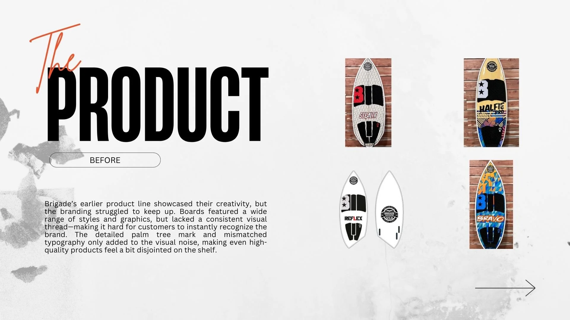
For over five years, I worked closely with Brigade Wakesurfing—a performance wakesurf brand known for their custom board graphics and high-quality craftsmanship. When they first approached me, they had a solid product but lacked a cohesive brand identity that could grow with them. Their original logo was overly detailed, hard to scale, and felt out of step with the performance feel of their boards. Across their apparel, packaging, and boards, the visual inconsistency was holding them back from the kind of recognition and reach their gear truly deserved.
That’s where we flipped the script. Over the course of a long-term retainer relationship, I helped create an entirely new visual brand identity, reworking their logo into something modern, versatile, and bold—centered around a simplified palm tree and custom “B” mark that paid homage to their roots while setting the brand up for better performance across all touchpoints. The refreshed design brought instant cohesion to everything from traction pads to shipping boxes, helping the brand feel more professional, polished, and retail-ready.
With a solid foundation in place, Brigade was able to scale their efforts, launching product collaborations with major names like Steve Aoki, Wynn Las Vegas, Dan Bilzerian’s Ignite, Pavati Boats, and influencers like Sofia Bevarly. The updated branding gave them a clean, recognizable canvas that could flex into different styles while staying grounded in the core identity—especially important as they continued to push out custom graphics and limited-edition drops… which I was grateful to be creating the artwork and design for.
Their apparel line also benefitted from the refreshed brand system. With a clearer, more defined style, Brigade was able to explore different looks and expand into streetwear-inspired pieces without losing their voice or connection to the core brand. That flexibility gave the company more creative freedom while still keeping everything under one recognizable umbrella.
The result? A noticeable jump in brand recognition, stronger retail presence, better social engagement, and record sales on some of their most popular board graphics. It’s proof that investing in your visual identity isn’t just about “looking better”—it’s about unlocking new opportunities, expanding your reach, and making it easier for people to remember (and rep) your brand.
Now if only we could get our hands on that website next…
Want help scaling your own brand identity for growth and creative flexibility? Let’s talk →